CSS provides several units to define the size of an element relative to the viewport. The most commonly used units are vh and vw. However, there are other viewport-relative units such as dvh, dvw, svh, svw, lvh, and lvw. These units are used to define the size of an element relative to the dynamic viewport, small viewport, large viewport, and initial containing block.
In this article, we will explore the power of dvh, lvh and svh in CSS for dynamic web layouts. We will also discuss other viewport-relative units and their practical applications.
What are viewport-relative units?
Viewport-relative units are used to define the size of an element relative to the viewport. The viewport is the area of the browser where the web page is displayed. The most commonly used viewport-relative units are vh and vw.
The vh unit represents the viewport height and is equal to 1% of the height of the viewport. The vw unit represents the viewport width and is equal to 1% of the width of the viewport.
In addition to these units, there are other viewport-relative units such as dvh, dvw, svh, svw, lvh, and lvw. These units are used to define the size of an element relative to the dynamic viewport, small viewport, large viewport, and initial containing block.
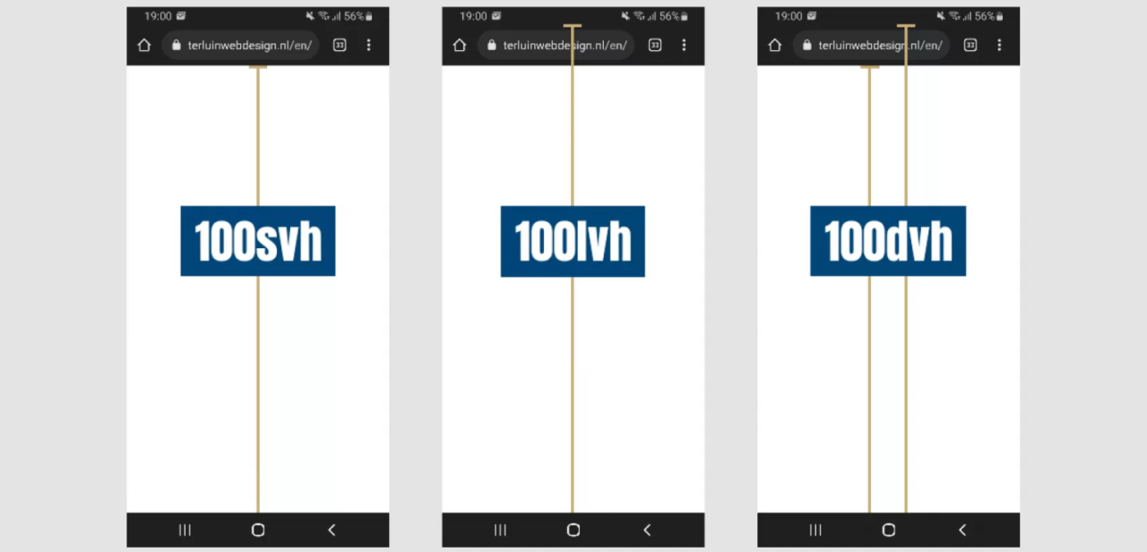
What is dvh?
The dvh unit represents the dynamic viewport height and is equal to 1% of the height of the dynamic viewport. The dynamic viewport is the height of the viewport after any resizing has occurred due to changes in the browser UI.
What is lvh?
The lvh unit represents the large viewport height and is equal to 1% of the height of the large viewport. The large viewport is the viewport size assuming any UA interfaces that are dynamically expanded and retracted to be expanded.
What is svh?
The svh unit represents the small viewport height and is equal to 1% of the height of the small viewport. The small viewport is the viewport size assuming any UA interfaces that are dynamically expanded and retracted to be retracted.
Why use dvh, lvh and svh?
Using dvh, lvh and svh over vh can be beneficial in certain situations. For example, when designing a website with a fixed header and footer, using dvh can ensure that the content of the page is always visible, regardless of the size of the browser UI. Similarly, using lvh and svh can be useful when designing for large and small viewports, respectively.
Other viewport-relative units
The dvw unit represents the dynamic viewport width and is equal to 1% of the width of the dynamic viewport. The svw unit represents the small viewport width and is equal to 1% of the width of the small viewport. The lvw unit represents the large viewport width and is equal to 1% of the width of the large viewport.
Conclusion
Viewport-relative units are a powerful tool for creating dynamic web layouts. The most commonly used units are vh and vw, but there are other units such as dvh, dvw, svh, svw, lvh, and lvw that can be used to define the size of an element relative to the viewport. Using dvh, lvh and svh over vh can be beneficial in certain situations, such as when designing a website with a fixed header and footer.