XPath is a powerful query language designed to navigate and select elements within XML or HTML documents. In JavaScript, the document.evaluate() method allows you to execute XPath queries to select elements from an HTML document efficiently. Selecting an Element by ID Using XPath in JavaScript Below is an example of how to use XPath in […]
HTML & CSS
Introduction to XPath Hey there! Let’s talk about XPath, a powerful tool for web scraping. XPath is a language that helps you navigate through XML and HTML documents. It’s especially useful when you’re using Scrapy, a popular web scraping framework. Why use XPath? The Basics Imagine HTML as a tree. The root isn’t part of […]
If you prefer not to update the Tailwind CSS configuration, you can use JIT mode to apply the following styles directly: Alternatively, to use classes like shadow-red-500, you can do this: Why No Official Support? 🤷♂️ Currently, Tailwind CSS does not officially support text-shadow classes. Adam Wathan, the creator of Tailwind CSS, recently tweeted: “What […]
While paywalled content often faces criticism, content creators have the right to safeguard their work. If you’ve decided to implement a paywall, there are several techniques to deter unauthorized access and prevent content theft. Here are some effective methods: By implementing these techniques, you can create additional barriers against unauthorized access to your paywalled content. […]
In web development, there are times when you might want to prevent users from selecting text on your webpage. This can be useful in cases where you want to protect the content from being copied or to enhance the user experience by preventing accidental text selection during interactions. Fortunately, CSS provides a simple way to […]
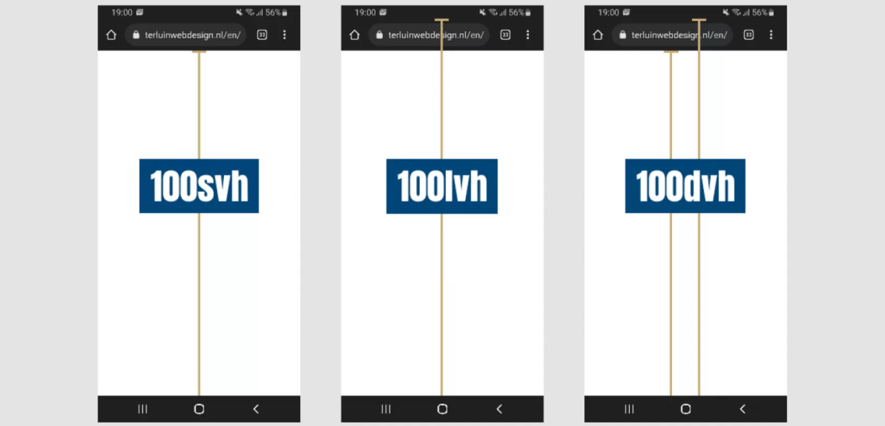
CSS provides several units to define the size of an element relative to the viewport. The most commonly used units are vh and vw. However, there are other viewport-relative units such as dvh, dvw, svh, svw, lvh, and lvw. These units are used to define the size of an element relative to the dynamic viewport, […]
In this article, we’ll look in detail at four handy length units that are relative to the browser viewport: vh, vw, vmin and vmax. These are truly “responsive length units” in the sense that their value changes every time the browser resizes, and they introduce incredibly useful options for sizing elements in CSS.
In this article, we’ll explore the four broad categories of CSS sizing units. We’ll look at what the sizing units are for, where they work best, and how to choose the best ones in each scenario, so that our layouts will be optimized across a range of media and device dimensions.


